Overview
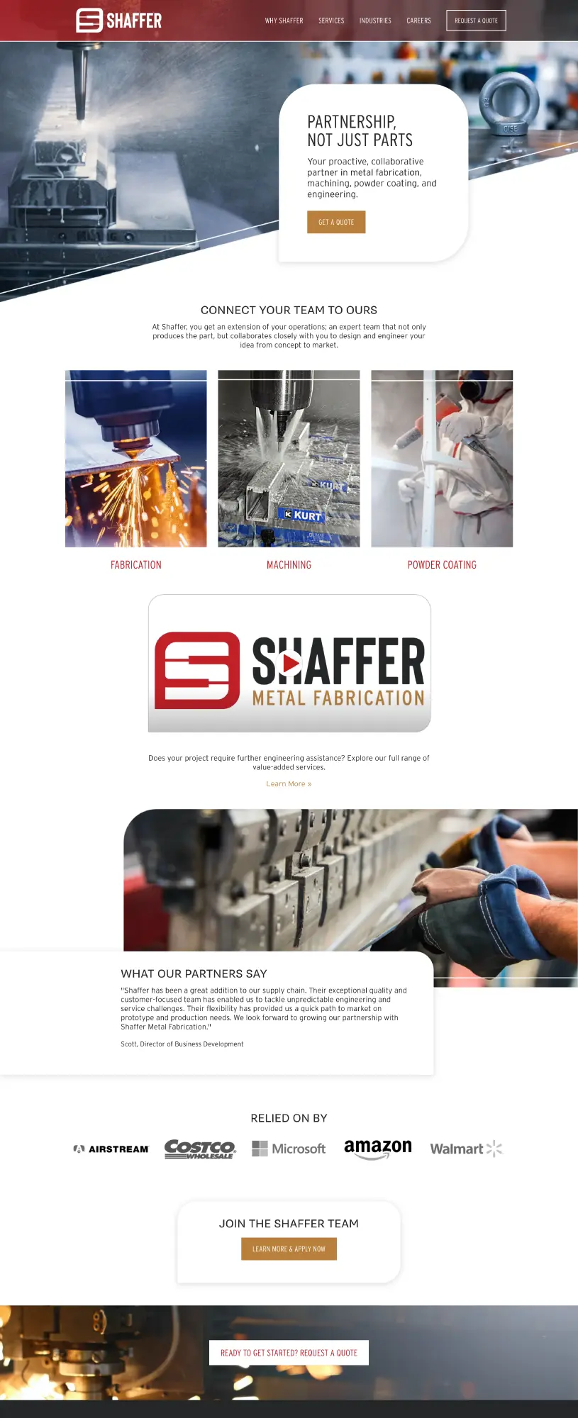
As a growing company, Shaffer Metal Fab turned to Marketing Essentials for an updated website that was professional, modern, easy to navigate and a viable sales tool. The website strategy included optimizing the site to meet today’s best practices, such as fast site speeds and mobile optimization. It also included SEO (search engine optimization), new branding and conversion points to increase the generation of quality leads.
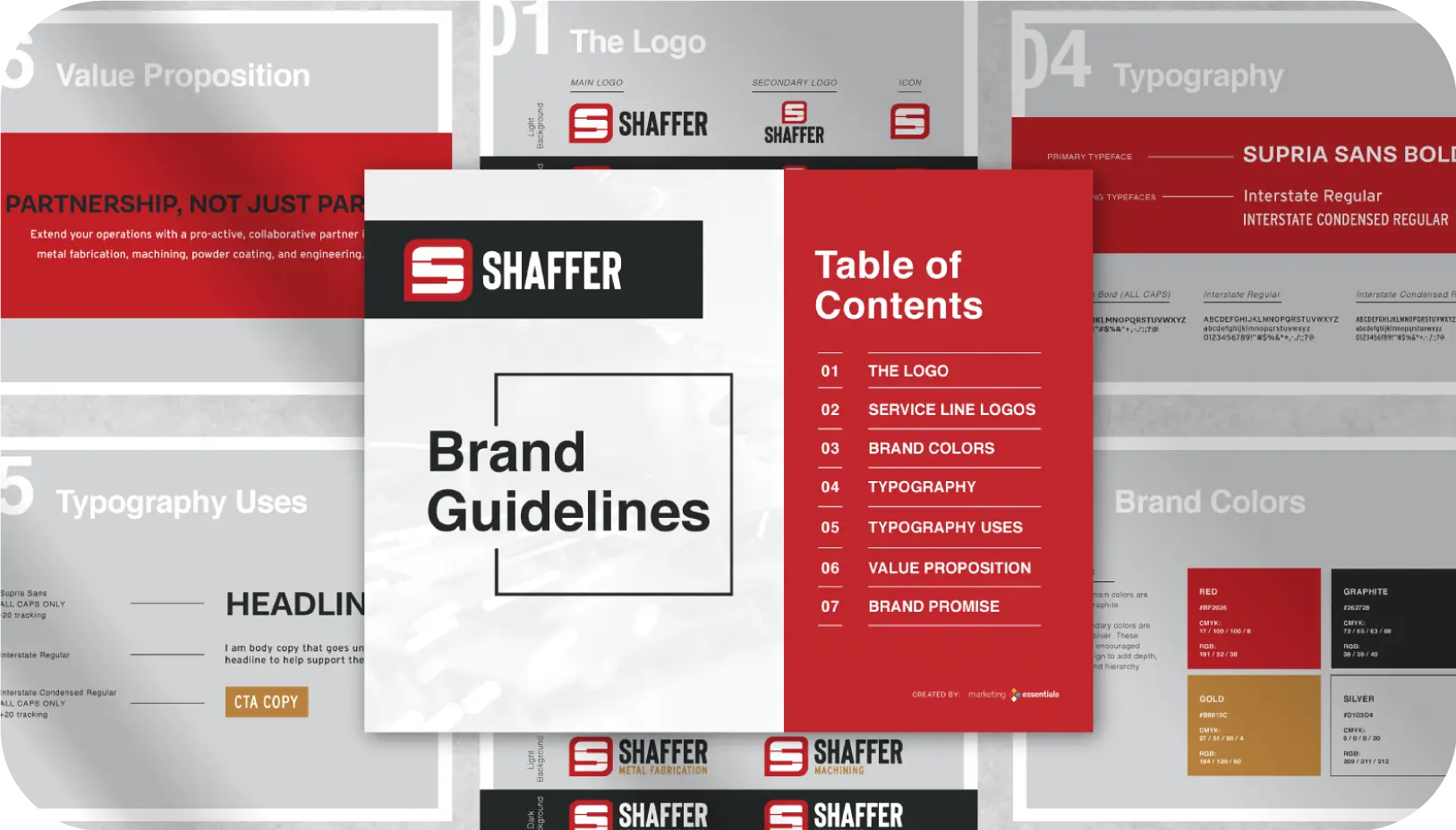
Along with a refreshed website, we also provided Shaffer Metal Fab with a new brand identity that reflected the company as an industry leader in metal fabrication. While they wanted a fresh new approach to their current logo, it was also important to keep in mind the brand equity the company had in its colors and piano symbolism from the original family logo. Their new logo focuses on relationships, connections and communication.
LET'S WORK TOGETHER.
