
Are you struggling to put together a comprehensive digital marketing plan that gets results for 2017? Maybe it’s time for a new website update, but you’re concerned you can’t work it into your budget. How will you get others to see the value?
Or perhaps it’s a lack of resources – you’re the Marketing Manager with no marketing department, so you aren’t sure how you’ll keep the site up to date once it’s live.
Many organizations face these same problems with website development. And we get it!
Our list of top website changes to consider in 2017 is based on strategy, getting leads, and most importantly, making your website work for your company. Your website should be a sales tool, not just a pretty site!
4 Website Changes to Capture Sales
Everything you do on your website should be focused on how it can convert a website visitor to a marketing qualified lead. You want – and need – a site that acts as an online extension of your sales team.
1. A Mobile-First Website Approach
Do not be mistaken. I’m not simply referring to having a responsive, or mobile-friendly, website. That is an absolute must-have if you want to make your visitors and the search engines happy. We’ve been preaching this one for awhile now (Read: Top Web Design Trends to Look for in 2016).
What I am referring to is an entirely different strategic approach to your next website (re)build. From the onset of the project, you should be considering first how your users will interact with your site while on smaller devices (iPhones, tablets, etc.), and, second, how they will interact with your site from their desktop.
“Google says 61% of users are unlikely to return to a mobile site they had trouble accessing and 40% visit a competitor’s site instead.” (MicKinsey & Company)

So how do you do this? Here are two quick ways to switch your project from a traditional website design with a desktop-first approach to the new mobile-first approach.
- Consider the context of your user when they are visiting your site.
Are they at their kitchen table drinking coffee and reading your blog? Or maybe they’re en route somewhere and need to quickly reference your phone number and address. If you can first uncover your user’s context and their challenges, you can design a site for smaller screen sizes that solves their problems and gets them the information they need. Focus on calls-to-action that are most important for them. And make the most important pages readily visible in the form of navigation items or links within the main copy. That is the first key to mobile conversions. - Design mobile and tablet mockups first.
When you’re ready to tackle the wireframes (structure) and mockups (design) of your website, work with your agency to develop the mobile and tablet versions first. These versions should capture all of the information most important to your user. As you increase the screen size, you can then add items in order of priority.
2. Authentic Photography, Not Stock Images
Your visitors can spot a stock photo a mile away. You know those canned photos of a business executive interacting with a client at a table filled with espressos and fake bar graph reports? Yeah, we all do. It’s not authentic, and your user can see right through it.
What they want is to understand what their experience will be like when working with your organization. They want an authentic experience with your brand, even when they are online.

It’s time to step up your game and use quality, original images throughout your site. We recommend hiring a photographer that can come onsite for a few hours to capture the culture and personality of your organization. Sounds expensive, right? It doesn’t have to be.
Consider the alternative: You may spend upwards of $75 per quality stock image to use on your site. Add to this the costs of losing the trust of your visitors, which in turn can affect their rate of conversion from a visitor to a qualified marketing lead.
Still worried you can’t fit this into your budget? Ask around. It’s likely that someone in-house can take some photos for you. However, if you go this route, keep in mind that poor quality images can instantly have a negative impact on your organization’s online branding. Properly vet the individual’s skills before you commit to using them to create a solid photo library.
3. Consistent Use of Videos & Cinemagraph
Videos are also becoming increasingly important as a form of content on the web. In 2017, we can look to videos as one of the most important forms of content you can push across your website and other digital marketing channels (social media, email marketing, etc.) to capture visitors and get them engaged in your brand.
Too many organizations shy away from using videos on their site because they fear the cost of video production. However, you can get great quality video using your smartphone. Remember, visitor attention span is short. Keep your videos to 30 seconds or less.
Here’s a quick tip for incorporating videos on your website: Ask a current client or customer to tell you about his or her best experience while working with your organization, and record it! These make for great video testimonials that you can incorporate throughout your website.
Another option is cinemagraphs, which are short video snippets set to loop on your website page. They’re becoming increasingly popular in place of the standard large header image on a website. We’ve also seen an increase in their use on various pages and placements throughout a site.
So what’s the benefit beyond being aesthetically pleasing? Cinemagraphs are a great way to tell a story on your webpage without shoving the page full of more words. We all know your brand story is an important part of gaining loyal customers who will spread the word about your product or service.
Check out these 14 Mesmerizing Cinemagraph Examples!
4. Tell a Story that Guides the User Through Your Site
As we look to 2017, the trend of storytelling on a website is only continuing to grow. It’s important to use the copy, images and videos on your site to create a compelling story so the user can understand your brand, your culture, and what you offer them – all without coming off as pushy or “sales-y.” (That’s where the authentic pictures and videos come in!)
Website Tip: If you can tell your story in fewer words, or you can summarize a paragraph with a stunning photograph, do it! You want the user to feel as if they are engaging with the site as they navigate it. They will appreciate the experience more and are much more likely to convert to a lead.
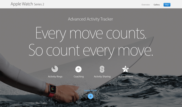
Here’s an awesome example of storytelling on the new Apple Watch Series 2 website. Because of the use of copy, continuous scrolling, stunning photography, and the elegant use of animation, you can’t help but be sucked into the site.
What is a Growth Driven Design (GDD) Website?
A growth-driven design website is focused on building – and launching – your new site in a short period of time so you can immediately begin gathering data from users, making site adjustments based on that data, and driving in traffic and leads.
As a CMO or Marketing Manager, you no longer need to worry about a time-consuming website overhaul that takes several months and then is outdated and stagnant by the time it launches. The GDD design is an innovative approach that allows you to continually update and adjust your site based on trends, user experience and your company needs.
Here’s how a GDD website build works:
- Develop website strategy based upon persona interviews (your buyer challenges and goals, what they are really looking for) and company and competitor research.
- Map out the design look and the architecture of the initial pages of the website, focusing on the top 10 to 20 pages that are most important to your visitor.
- Build the site according to the strategy so everything is focused on funneling the user through the site until, finally, they make an “interaction” with your site that qualifies them as a lead (via a contact form, email newsletter signup, etc.)
- After the initial site launch, you can spend dedicated hours each month building out the rest of your site, making adjustments based on user experience, and incorporating new items that are part of your website wish list.
 Photo Cred: http://www.growthdrivendesign.com/
Most importantly, though, the quick launch of the site allows you to immediately start gathering data about how users interact with your site. That way, you can make real-time changes that will increase the visitor conversion rate.
Planning your digital marketing and website efforts for 2017 is a crucial part of establishing a solid overall marketing plan. It’s easy to get wrapped up in the mindset of “Our site is old and needs replaced. Let’s build a new site so that we can check that off our list and then forget it.”
Why not make the most of your website investment? You want – and need – a site that acts as an online extension of your salespeople. If your site is not converting visitors to qualified leads (which ultimately increases your revenue), then it’s not doing its job.