A key design element that will improve your conversion rate optimization (CRO) is visual flow.
Visual flow motivates a user’s eyes and mouse-click to take the next logical step in a conversion process. Visual flow directs the eye on a screen.
Through a pre-planned design, information is mentally digested in a hierarchy method. On well thought-out paths, there are no snags, friction or clutter. You plan on what the viewer reads at different steps of their buyer journey.
10 Ways to Move Your User’s Eyes Where You Want
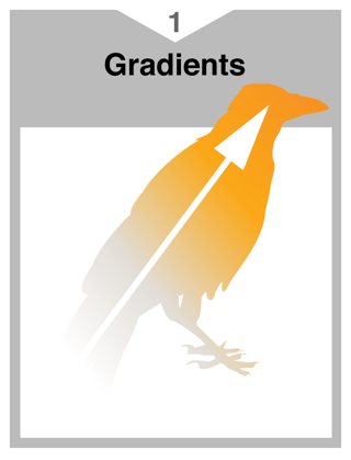
- Gradients
Continuous and smooth transition of one color to another that usually fill a region or shape creates a visual movement that allows the eye to travel from one point to another.
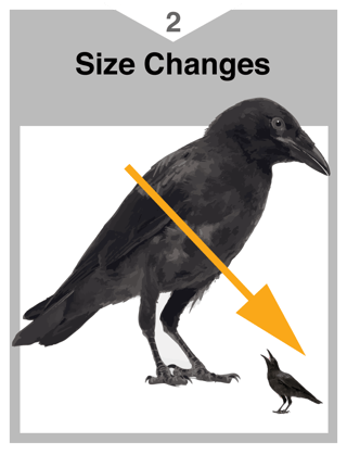
- Changes in Size
Two or more similar objects that have a noticeable difference in size will create visual path from one to another.
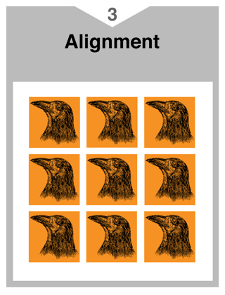
- Alignment
This is a simple and often overlooked tool. Alignment (line up) creates a visual connection between related elements and avoids clutter.
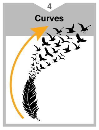
- Curves
Curves imply a fluidity that other types of lines often cannot. Curves are frequently used for decoration and as separators between design elements. Curves are also a great tool to get the viewer’s eye from one part of a design to another.
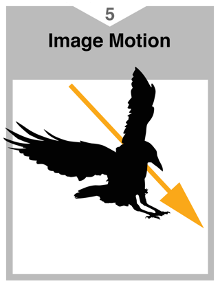
- Image Motion
Most images have a natural direction. Its best to have that direction pointing into your story.
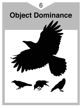
- Object Dominance
This creates an entry point on the page from which you can lead the viewer to other parts of the page.
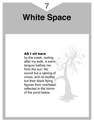
- White Space
This is important in design to help establish boundaries between graphics, providing each item in your design with its own outlined territory. Lead the user from one territory to the next based on where you want them to go.
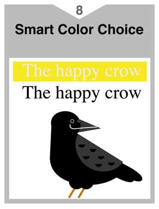
- Smart Color Choice
Color can work for you or against you. When some bright colors are displayed together, they can appear to vibrate. This effect makes an image difficult to look at or read and makes a viewer quickly divert their gaze to something with a more neutral hue.
- Demographic Images
While a design may look good, it might not be the best possible communication for the audience. Don’t turn them away with the wrong images. When in doubt, always remember who the persona is, walk in their shoes and think how they would behave to the images you have selected.

- Overall Composition
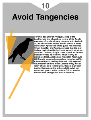
Avoid tangencies. Tangents occur when the edges of two or more forms touch or are aligned very close together. Tangent objects may cause the viewer to focus attention on only this part of the design while missing the overall composition.
Think of visual flow as a moving river that carries a reader from one point of a story to another. Whereas the opposite of that easy transition would be rocky-river bed devoid of any water.
As shown in a 2012 Google study, readers will pass judgment on the complexity of page in under a half a second. Careful thought into a simple design will help improve your CRO goals.


